The First Page of the Menu
The opening words, categories and prices tell diners what kind of confidence and knowledge the room expects.
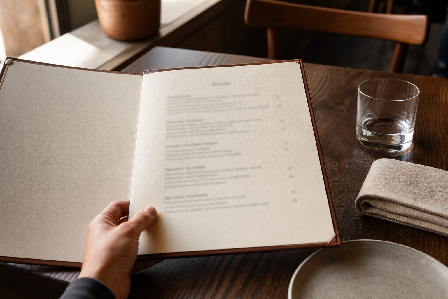
The first page is already speaking.
It may welcome the diner with a paragraph about the restaurant’s farm, its neighbourhood or the cook who began the recipes. It may offer only a name, a date and a great deal of empty space. It may open directly with snacks, breads or raw things, as if the meal has already started and the diner needs only to catch up.
Before anybody chooses a dish, this page has begun to explain the room.
Its words suggest whether the restaurant will guide or challenge, reassure or impress. Its categories reveal how the kitchen understands a meal. Its prices show not only what dinner will cost, but how comfortably the restaurant expects money to be discussed. Even the information left out makes a claim about what diners are presumed to know.
A first page has little time to establish all this. It must introduce a voice while also helping hungry people make practical decisions. When it succeeds, the diner feels oriented without feeling managed. When it fails, uncertainty arrives before the food does.
Restaurant menu language creates the welcome
Some menus begin with hospitality in its most direct form: welcome, thank you for coming, this is how we like to serve.
These sentences can make a large room feel more personal. They can tell a first-time visitor that questions are expected, that dishes are intended for sharing or that the kitchen will happily adjust a particular ingredient. A short introduction can give the diner the confidence to enter the meal without first decoding the restaurant from clues.
The same space can become burdened with autobiography.
A page crowded with origin stories, philosophies and declarations may ask the diner to admire the restaurant before experiencing it. Every ingredient is exceptional. Every supplier is beloved. Every dish represents a journey. The language is not necessarily untrue, but the accumulation can make hospitality sound like a demand for attention.
Voice becomes convincing through proportion. A restaurant does not need to explain everything it values on the first page. It needs to tell diners what will help them begin.
This might be one clear sentence about the way the menu works. It might be the name of the person whose recipe is being served. It might be a note that much of the produce comes from a nearby growing project, followed by enough detail elsewhere for anyone who wants to know more.
Confidence does not require silence, and warmth does not require a long introduction. The first page can speak generously without taking over the conversation.
Menu categories teach the diner how to build a meal
Starters, mains and desserts describe a familiar sequence. Small plates suggest circulation. From the garden, from the sea and from the fire organise food by source or method. A list divided into bites, bowls and feasts proposes a different rhythm again.
These headings are not neutral containers. They teach the diner how the restaurant imagines eating.
A conventional structure can be deeply useful. People know approximately how many dishes to order, when they will arrive and which prices represent the centre of the meal. Familiar categories leave more attention for unfamiliar ingredients.
Less conventional sections can invite another kind of experience. They may loosen the boundary between starter and main course or give vegetables equal status with meat and fish. They can encourage a table to order collectively rather than as separate individuals.
But a creative heading does not automatically create a generous menu.
If diners cannot tell whether a dish is a mouthful or enough for two people, the category has stopped doing practical work. A server can explain, but the diner must first recognise that explanation is needed. People who are shy, dining across a language difference or worried about appearing inexperienced may simply guess.
The best category names carry imagination and information together. They allow the restaurant to express its way of cooking while giving diners enough structure to understand the size, sequence and relationship of the dishes.
The menu is not diminished when people know how to use it. Clarity makes curiosity safer.
Dish names decide how much context diners receive
One menu writes: tomato, peach, basil.
Another writes: salad of heritage tomatoes with white peach, basil oil and cultured cream.
A third keeps the dish’s name in its original language and adds no explanation at all.
Each version creates a different relationship between restaurant and diner.
A list of ingredients can feel elegant and open. It lets the plate supply the grammar. It can also hide the information a diner most needs: whether the tomato is raw or roasted, whether the cream is central or incidental, whether the dish is light, rich, hot or cold.
A detailed description offers more certainty, but too many adjectives can turn appetite into administration. The diner reaches the end of the sentence having processed provenance, technique and texture without yet knowing whether the dish sounds pleasurable.
Keeping an established name can protect the dish from being translated into something narrower and less accurate. Yet a name without context may function as a test. Diners who recognise it feel included; those who do not must ask, search discreetly or choose something else.
There is no single correct amount of explanation. The useful question is what the wording allows a diner to decide.
Can someone identify an ingredient they cannot eat? Can they understand the basic character of the dish? Does the original name remain visible when a short explanation is added? Does the description invite a question, or make not knowing feel like a failure?
A menu can respect culinary language without using it to establish rank. Explanation does not have to flatten a dish. It can open the door through which the name becomes meaningful.
Restaurant menus imagine a reader
Every menu imagines a reader.
The reader may be expected to recognise a regional cheese, a cut of meat, a fermentation method or the difference between two styles of noodle. They may be expected to understand that three plates per person is normal, that bread costs extra or that a listed price covers the whole table.
Some assumptions are unavoidable. A menu cannot define every term or anticipate every question. Trouble begins when the restaurant mistakes specialised knowledge for common knowledge and treats the resulting confusion as the diner’s deficiency.
This is especially visible on the first page because the first page sets the terms of participation. A diner who encounters five unfamiliar words in the opening section may conclude that the entire meal requires expertise they do not possess.
That discomfort is not always a reason to simplify the food. Unfamiliarity can be one of the pleasures of eating out. The restaurant can preserve it while making help easy to receive.
A brief description, a small note about ordering or an attentive first exchange with the server can change the meaning of not knowing. The diner is no longer outside the restaurant’s intended audience. They are simply at the beginning of learning something.
Hospitality does not mean ensuring that every guest recognises every word. It means ensuring that recognition is not the price of belonging.
Menu legibility is part of restaurant hospitality
A menu can use clear words and still make those words difficult to reach.
Small type, pale ink, reflective paper and crowded columns turn reading into physical effort. Low dining-room light may create atmosphere while making the first page disappear. A diner holds the menu closer, tilts it toward a candle or asks somebody else to read aloud. The content may be generous, but the form has made independence conditional.
Legibility is not the same as visual plainness.
A restaurant can have an expressive typeface, unusual paper and a strong sense of composition while still protecting contrast, scale and spacing. Hierarchy helps readers distinguish a section title from a dish, a description from a price and an optional note from information that changes the order. Empty space is useful when it creates orientation rather than simply signalling luxury.
The conditions of service should be part of the design test. A menu that looks elegant under studio lights may fail after sunset. A type size that works for the designer at a desk may exclude an older diner, somebody with low vision or a guest whose eyes are tired after a long day. Reading across a language difference also takes more time and benefits from a page that does not crowd the words together.
Practical alternatives matter. A large-print version should be accurate and available without drama. A digital version can allow enlargement, but it should not be the only accessible option or require a diner to own a charged phone and a data connection.
The first page should not make a person announce a reading difficulty before the restaurant offers readable information.
Prices have a tone as well as a value
The first page is also where appetite meets arithmetic.
Some menus line prices into a neat column, allowing the eye to compare them immediately. Others place a smaller number quietly beside each dish. Currency signs may be prominent, absent or explained once at the bottom of the page. A tasting menu may present one large figure before the diner has read what it includes.
Designers sometimes try to make prices visually discreet so that diners will concentrate on desire. But the need to understand cost does not disappear when the numbers become harder to find.
For many people, reading a menu involves continuous calculation. They are considering a shared budget, the cost of drinks, whether service is included and whether ordering the least expensive dish will be noticeable. Unclear portion sizes make this calculation harder. So do supplements disclosed late, unexplained market prices and menus that require the diner to ask aloud about every financial detail.
Transparent pricing is not inhospitable or unromantic. It lets people make decisions without performing ease they may not feel.
The restaurant’s tone appears in how it handles this reality. A clear note about service can prevent anxiety at the end. Portion guidance can help a table avoid ordering too little or spending more than intended. A supplement can be shown beside the relevant choice instead of introduced after enthusiasm has formed.
Money is already present at the table. Good menu design allows it to be present without humiliation.
Dietary and allergen information must be easy to find
For some diners, the first reading of a menu is not about appetite. It is a search for safety.
They look for an ingredient, an allergen key, a statement about how questions are handled or a sign that the restaurant understands the difference between preference and risk. If this information is hidden at the end of a long menu, available only through an unexplained symbol or dependent on catching a server’s attention, uncertainty begins immediately.
The first page does not need to carry a complete technical matrix. It should establish a reliable route to the information.
A brief note can invite diners to identify allergies before ordering and explain whether written details are available. The kitchen and service team then need the same current information. A confident sentence on the page is harmful if the person answering questions must guess, if substitutions are not recorded or if the menu has changed without the allergen record changing with it.
Dietary labels also need restraint. “Vegetarian,” “vegan” or “gluten-free” may describe ingredients or preparation choices, but they do not automatically communicate the management of cross-contact. A leaf symbol should not be asked to carry more certainty than the restaurant can support.
Written information and conversation work best together. The page lets diners identify possibilities without disclosing private needs to the whole table. The conversation allows staff to clarify preparation, changes and risk. Neither should be treated as a substitute for accurate kitchen practice.
A welcoming menu does not promise that every dish can serve every diner. It makes the available choices and the limits of adaptation honest enough for a safe decision.
The online menu may be the real first page
Many diners meet a restaurant’s menu before they enter the room.
They open it while planning a journey, comparing budgets, organising a group or deciding whether dietary needs can be accommodated. The website, booking page or linked document becomes the first page, even if the restaurant thinks of it as a secondary copy.
An online menu therefore carries the same responsibilities as the printed one, with additional ones.
A photograph of a menu may preserve the intended typography, but its text cannot enlarge or reflow well and may be inaccessible to screen readers. A long PDF can be awkward on a phone. A QR code placed on the table is not a complete digital strategy if the linked page loads slowly, requires repeated pinching and scrolling or hides prices behind decorative animation.
Accuracy matters too. Seasonal cooking makes exact permanence impossible, but an old menu presented without a date can mislead diners about dishes, prices and allergens. “Sample menu” is useful only if the differences a guest needs to anticipate are still explained. A simple current page is often more hospitable than an elaborate file nobody updates.
The online menu can also offer what paper cannot: adjustable text, translations, fuller ingredient context and a clear route for contacting the restaurant before arrival. Those possibilities should extend the welcome rather than create a separate, less reliable version of it.
By the time a diner reaches the table, the first page may already have answered the most important question: is this a place where I can participate?
The menu’s first page continues in the server’s hands
No menu has to do all the work alone.
A server may greet the table by explaining that dishes arrive when ready, identifying a daily preparation or asking whether anyone has an allergy. This conversation can make the page more spacious because the restaurant knows essential guidance will be offered by a person.
It can also repair what the page has made confusing.
The difference lies in whether spoken guidance is dependable. If one table receives a warm explanation while another is left to work out the format, the menu’s accessibility depends on attention, confidence and chance. Diners who know which questions to ask receive a fuller restaurant than those who remain quiet.
The first page and the first conversation should support each other. Information important to safety, price or ordering belongs somewhere diners can reliably encounter it. Human guidance can then do what print does less well: respond to hesitation, notice interest and adjust the amount of detail to the people at the table.
A good server does not recite the menu as if the diner has failed to read it. They give the page a human voice.
A restaurant menu should invite, not examine
The first page does not need to make the restaurant completely knowable.
Some mystery belongs in a meal. A short description can leave room for the appearance of the plate. An unfamiliar name can lead to a useful conversation. A category can gently interrupt the diner’s usual way of ordering.
But uncertainty should lead toward discovery, not toward fear of making the wrong choice.
The most successful first pages create this distinction quietly. They establish character without requiring admiration. They use the language of the food without turning vocabulary into a gate. They make prices readable, assistance available and the shape of the meal clear enough for diners to begin.
Within seconds, a reader understands something essential: this restaurant has an idea of who you are.
It may imagine you as an expert, a guest, a customer, a collaborator or a stranger expected to learn the rules quickly. Every later part of the meal can complicate that first impression, but the opening page has already placed you in relation to the room.
The generous menu leaves that imagined diner enough space to be a real person.
They may ask what a word means. They may choose by price. They may want the familiar dish or the one they cannot yet picture. They may need guidance, or only time.
The page speaks first. What matters is whether its voice says: you should already know—or whether it says: this is where we begin.